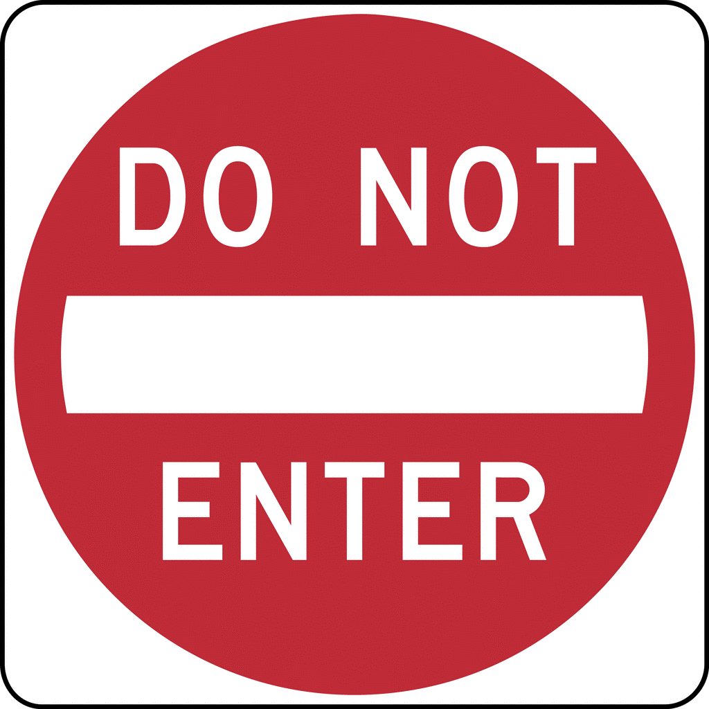
No, I haven't actually see a sign posted "Do Not Enter" with the church's name inscribed above it; but I might as well have.
Here are a few less than helpful signs that I have noticed recently: 1) the sign that is set back and parallel to the road requiring the reader to turn his head a full 90 degrees to the road that he is driving on to be able to read it, 2) the sign that has color combinations that make the letters and words indistinguishable against the background, 3) the temporary banner that has come loose on one end and is essentially limp, at least, when not flopping in the wind, 4) the sign that is obscured by the foliage of the trees or shrubbery that surround it; and yes, I have seen several of these. Then there is 5) the amateurish sign that sits in front of a multi-million dollar church building, and 6) the faded and weathered sign that looks like it has been there unchanged for 20 long winters and summers. 7) At least one sign I have seen is shockingly close to "Do Not Enter;" I am too embarrassed for the church to even describe it.
In each of these locations, the intended message of the church sign is sabotaged by the sign itself. Signs intended to be inviting can, by placement and presentation, become very un-inviting. You may READ "Do Not Enter."
Here is a lesson from the signs above: signage already in place can’t be taken for granted; signage for your church should be reviewed for effectiveness. (In doing that, be careful and objective. The fact that you know what the sign says and what it is intended to communicate, doesn’t mean that someone else will know--- especially when the other person is traveling by at 40 mph in traffic with the sun glaring through the windshield, and not really paying attention to the sign anyway. If you really want to know if a sign is effective, test it under those conditions. Or better yet, have someone that doesn’t know already what it says test it under those conditions).
Here are some things to take into consideration:
Size: Is the sign (and lettering) big enough to be seen? Can people that don’t know already what it says, read it from a distance and at driving speeds in traffic? As a rule: big is better.
Location: When people approach the church from the east, west, north, and south, will the sign be readily apparent? Will they have to turn their head to the side to find and read the sign? Do obstructions (e.g., buildings, foliage/shrubbery, poles,and other signs) hide any part of the sign? Are more signs needed?
Appearance: Does the signage match up with the way the church desires to present itself? Is the sign up to date, professional, and attractive?
Content: Does the signage communicate the essential message? Church name and service times are the most obvious; a simple web address is also valuable. Avoid content clutter. Less is more. Is the content visible from all directions?
In addition to fixed signs, banner type signs can also add to the message, expand visibility, and create interest. Consider the use of professionally prepared banners placed in strategic locations (avoiding sign clutter) to communicate information regarding upcoming events, sermon series, and worship times.
Keep in mind that potential first-time guests could be making decisions about your church right now purely on the basis of your signage. What does the sign signal to a potential guest? What does it signify to the hundreds or thousands that drive by and see it every day?
Not all signs are created equal. Some help; some hurt. Which is it at your church?
